
There are two million people living in the UK who currently suffer from sight loss - that's enough to fill Wembley Arena 160 times over! This number is set to rapidly increase, due to the ageing population, and will reach 2.25 million by 2020.
If you had a brick and mortar shop, you'd ensure it was physically accessible for anybody and everybody that wanted to visit, so surely you should be striving to do the same on your website? In this blog post, we'll tell you everything you need to know about catering your website to a range of visual impairments, meaning no user will be left behind.
1. Understanding the Technology
Most visually impaired people use two types of assistive technology that enables users to access websites; screen readers and refreshable braille displays. In order to give these devices they information they need to pass onto the user, you, as a website owner, needs to give the user as much information as possible so they can have the same quality experience as a person without any visual impairment.
2. Don't Skip on the Alt Text
Alt text is the text used in the HTML markup to describe what an image is. This is used for many things, including building context for users, helping visually impaired users to understand the image and the website as a whole, helping search engines to understand the topic and helping users to understand topics if the image resource fails to load.
So when writing alt text consider the context around the image and how it is read. Not just the image as an isolated entity; what happens if that image isn't there? Does it make sense?
3. Be As Descriptive As Possible
When writing alt text for an image, you should always do so with a visually impaired user in mind.
Key points to consider when describing an image include:
- What message or information is the image trying to convey?
- Who or what is the focus of the image?
- Is the setting of the image important?
- Does the person/people in the image have an expression?
- Is the person performing an action?
- Are the colours important?
A common mistake when writing alt text is being too simplistic in the description. A classic example of this can be seen in the image below.
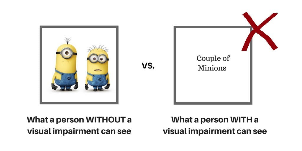
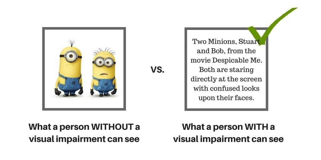
This image could be described as a ‘couple of minions, however, if I told you to draw a 'couple of minions' would your end result be that of the above? Probably not. If I told you to draw 'the minions Stuart and Bob from the movie Despicable Me staring with confused looks upon their faces', you would likely get much closer to the end result.
There is no text limit when it comes to alt text, but we would recommend to keep it as short and concise as possible while still containing all the information needed.
4. Always Describe Actions on Clickable Images
Some images, such as the logo on a home page, are there to represent an action that can be taken on a website. For example, when clicking on the logo on a website, you will be taken back to the home page.
Therefore, if you have an image containing an action on your website, you must make it clear what the image is and what will happen when the image is clicked on.
Below is an example of a bad alt text on an image.
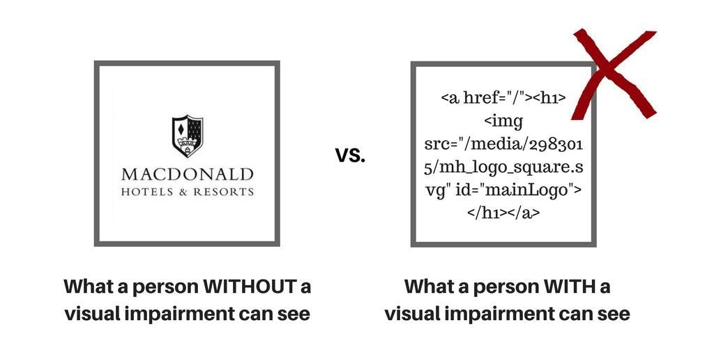
Here, a visually impaired user is presented with the code version of the logo. The logo is not explained, nor is its related action explained. The following is a good example of alt text:
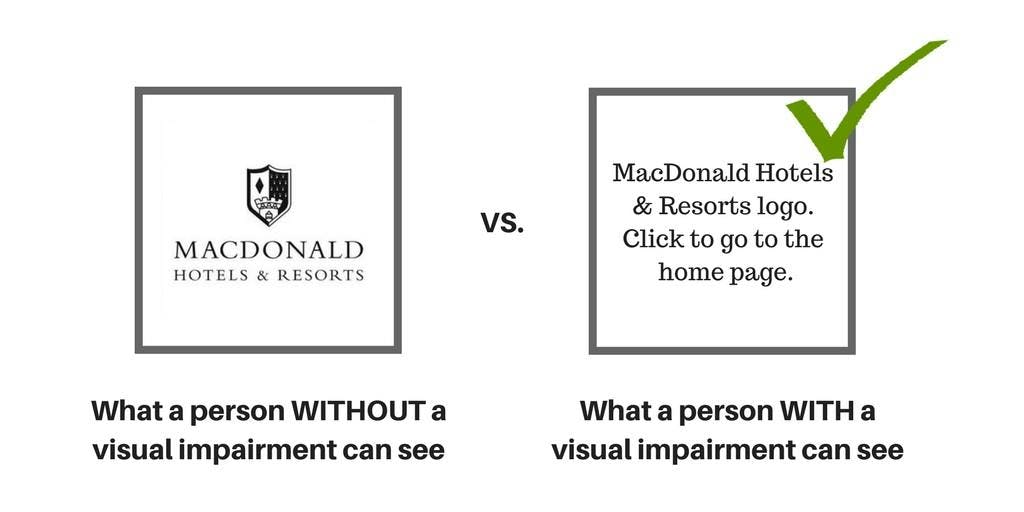
Here, the user has both the image and the action clearly explained to them. This will make it much easier for the user to navigate around your website without having to read endless amounts of confusing code.
5. Don't Repeat Yourself
A common misconception is that all images should have alt text, however, this is a common misconception.
If the content on your site already contains information about the image, then there is no need to repeat this on the alt tag, in fact, in this case, it is better to have no alt tag at all as opposed to repeating yourself.
Your end goal is to provide a seamless experience for an impaired user, and if they're consuming the same information twice, their experience won't be as smooth as that of a user without an impairment.
6. Don't Call an Image ‘An Image'
When writing your alt text, never start your description with ‘an image showing…. The tag within the HTML will let the user know that this is an imagine and you're simply wasting time by explaining that it is an image.
Instead, this precious space can be used for describing the image in more detail. Here are a couple of examples of how alt text should read:
- A comic book illustration of a camel laughing at a sheep drinking a glass of wine from a brown shoe
- The Mona Lisa, a head and shoulders portrait of a woman by the Italian artist Leonardo da Vinci
7. What is the Purpose of the Image?
When writing your alt text, you'll need to take into account the reason why the image is there. What value does this add to the user and what is the message that you want to communicate to users through this image?
To explain this a little further, we'll use this screenshot from the Monarch Airlines website.
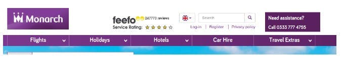
In the header of their website, Monarch has included an image of their Feefo review rating. Of course, this rating is there as a trust signal to encourage visitors to book a flight, however, the image has no alt text, meaning this is what visually impaired users can see:
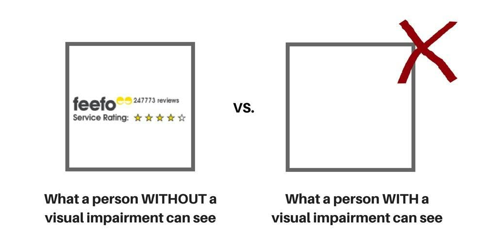
Which is a whole lot of nothing. Meaning Monarch are not promoting this important trust signal to a portion of their audience.
Another common mistake would be creating alt text that simplistically states what the image is. For example:
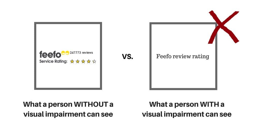
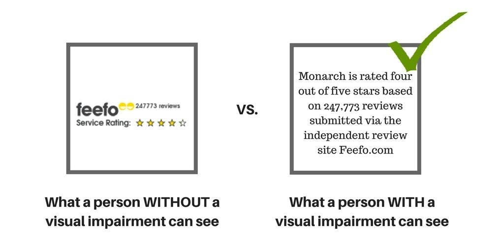
Again, if we think about the goal of the image, we aren't trying to tell the user that Monarch uses Feefo, were trying to tell the user that Monarch has a great Feefo rating and is a service trusted by many. So, with that in mind, the following would be an appropriate alt text description:
Another common example of this problem on websites is payment logos at checkout. Many sites will have payment logos to show accepted payment methods, but will have alt text that simply reads 'payment logos'. This does not give a visually impaired person the information they need.
To avoid this, give the user the exact information they need to make a smooth purchase. For example, 'We accept Visa, MasterCard and Solo'.
8. Cater for All Types of Visual Impairment
There is a wide range of issues that fall under the umbrella of visual impairment, including those who are partially sighted and colour blind. Therefore, as well as writing clear and concise alt text for your website, you need to ensure that your site can be easily seen for all users.
In current web design, there is a huge trend of picking colours based on their 'subtle' contrasting tones rather than their usability. However, these contrasting tones (such as dark blue text on a light blue background) can make it near impossible for some people to view, causing a fundamental flaw to the entry of your site.
How We Can Help
If you need help with making a website more friendly for the visually impaired, please don't hesitate to get in touch by calling 0161 402 3170, by emailing or by filling in our contact form.
Alternatively, visit our web development and SEO services pages to find out more.

Need help with digital marketing? Get in touch!
I-COM Digital Marketing
With a large in-house team of specialists we provide a range of digital services including web design, web development, digital marketing, SEO, branding, content marketing, PR and outreach, social media marketing and paid search marketing, we cover every digital marketing need you may have.
Call us on 0161 402 3170 or use the contact form to get in touch.